Discount on all Smart appliances up to 25%
Shop great deals on MacBook, iPad, iPhone and more.


Popular Categories
The Best Offers
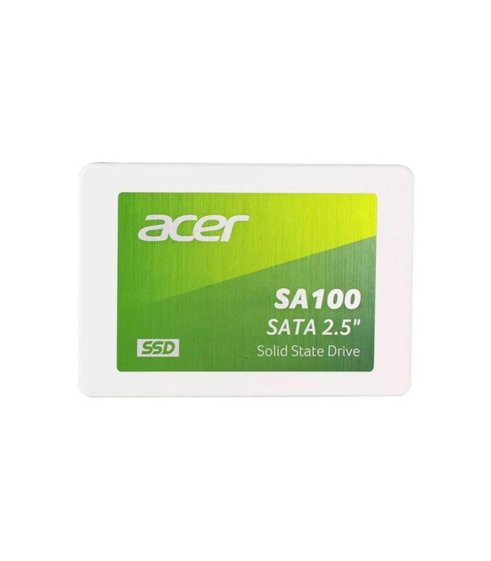
Acer SA100 SATAIII
In stock
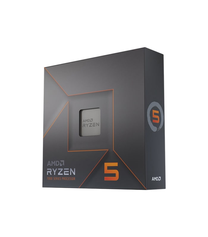
AMD Ryzen 5 7600X
In stock
Apple iPad Mini 6 Wi-Fi
In stock
Apple MacBook Pro 16″ M1 Pro
In stock

New Goods
2013 Intergraph SmartPlant
In stock
24 تکنیک موثر برای افزایش فروش از برایان تریسیآموزش فارسی، تصویری و مالتی مدیای ۲۴ تکنیک فروش - برایان تریسی
Out of stock

Apple Shopping Event
Hurry and get discounts on all Apple devices up to 20%
24 تکنیک موثر برای افزایش فروش از برایان تریسیآموزش فارسی، تصویری و مالتی مدیای ۲۴ تکنیک فروش - برایان تریسی
Home Appliance
2013 Intergraph SmartPlant
In stock
24 تکنیک موثر برای افزایش فروش از برایان تریسیآموزش فارسی، تصویری و مالتی مدیای ۲۴ تکنیک فروش - برایان تریسی
Out of stock
Acer SA100 SATAIII
In stock

Microsoft Accessories
Personalize your Surface Pro with Microsoft branded accessories. In the presence of many colors for every taste.


2013 Intergraph SmartPlant
In stock
Recently Viewed
Our Articles
Best Gaming Laptop Models
At solmen va esser necessi far uniform grammatica, pronunciation e plu sommun paroles…
How to choose a HI-FI stereo system
Nullam dictum felis eu pede mollis pretium. Integer tincidunt. Cras dapibus. Vivamus elementum semper nisi…
Logitech POP Keys
Maecenas nec odio et ante tincidunt tempus. Donec vitae sapien ut libero venenatis faucibus. Nullam quis ante. Etiam sit amet orci…
Cameras for Street Photography
3 Minimalist Desk Setups
Online store of household appliances and electronics
Then the question arises: where’s the content? Not there yet? That’s not so bad, there’s dummy copy to the rescue. But worse, what if the fish doesn’t fit in the can, the foot’s to big for the boot? Or to small? To short sentences, to many headings, images too large for the proposed design, or too small, or they fit in but it looks iffy for reasons.
A client that's unhappy for a reason is a problem, a client that's unhappy though he or her can't quite put a finger on it is worse. Chances are there wasn't collaboration, communication, and checkpoints, there wasn't a process agreed upon or specified with the granularity required. It's content strategy gone awry right from the start. If that's what you think how bout the other way around? How can you evaluate content without design? No typography, no colors, no layout, no styles, all those things that convey the important signals that go beyond the mere textual, hierarchies of information, weight, emphasis, oblique stresses, priorities, all those subtle cues that also have visual and emotional appeal to the reader.
